views:

1924

answers:

27

Update: I deleted my motivation because it seems to distract readers. This is not about "why don't you make your window smaller". See the screenshots and you will see obstructed text because of fixed width. See my reference to "em/ex" notation in CSS. I would like to have a real discussion here. Thank you.


Now I would like to ask real experts on this topic -- I'm not a web designer -- why fixed width layout are still that popular and if there are really good reasons for it. (you are welcome to point out reasons against it as well.)

  • Is it too hard to design your layout relatively (from start on)? It seems some people even forgot how to do it.

  • Do you have real reasons like readability and just don't know how to deal with it correctly? Here I'm referring to pieces of wisdom, like it's harder to read longer lines (that's why newspapers use columns) -- but then, width should be given using em and ex.

  • Are you forced by some old guidelines? In the dark old age of HTML, people did a lot of things wrong; now everybody finally uses CSS, but perhaps this one just sticked.

  • Or are you like me, wondering why everybody is doing it "wrong"?

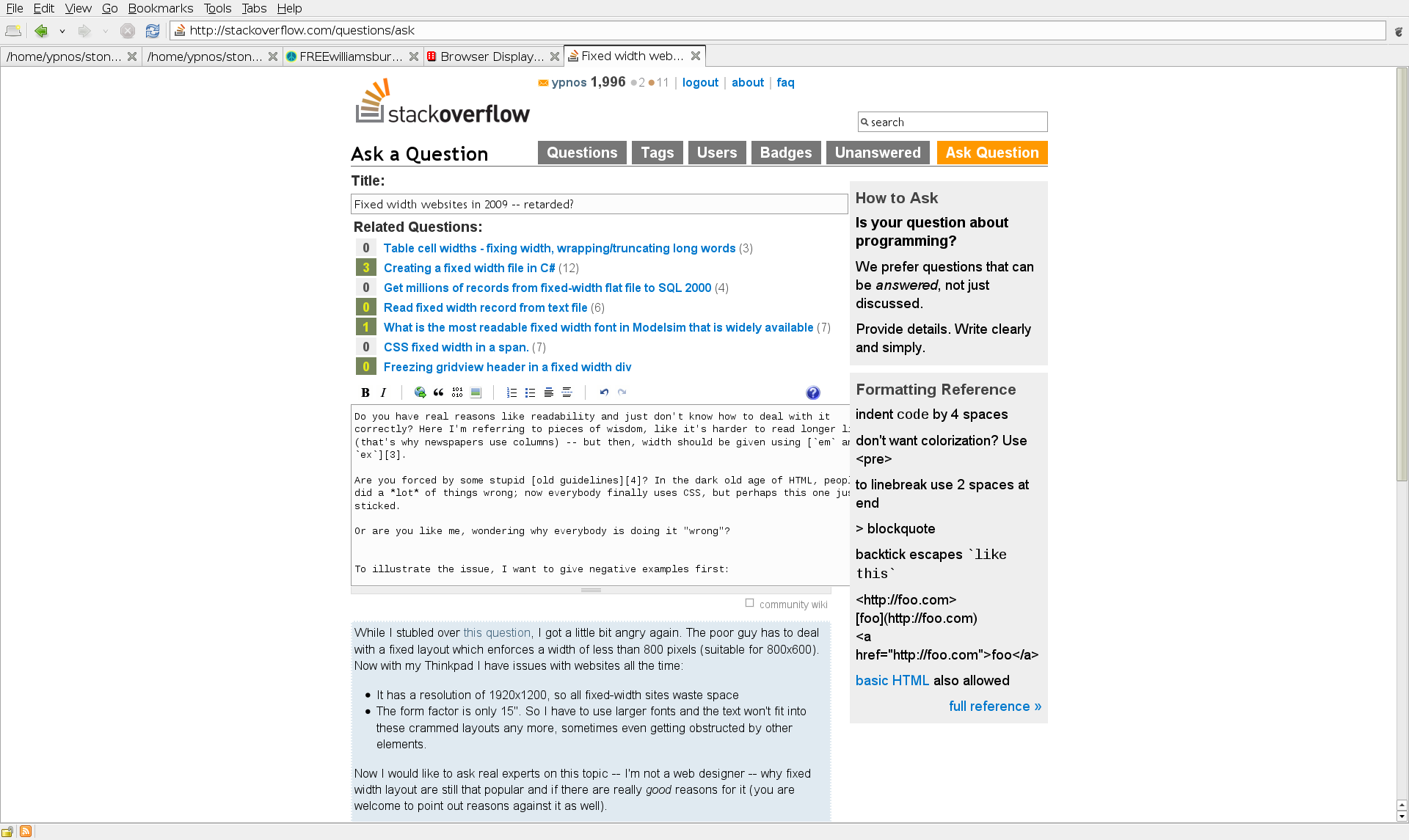
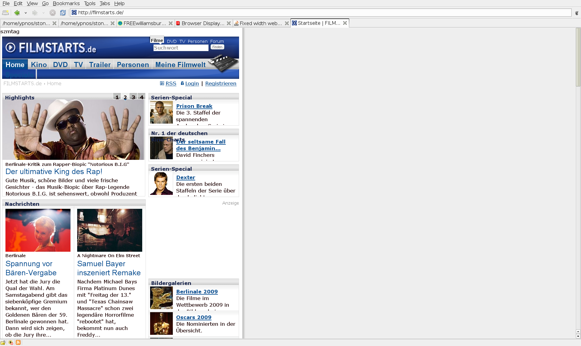
To illustrate the issue, I want to give screenshots of negative examples first:

  • StackOverflow (here I can't even see what would make it any hard to fix it)
  • Filmstarts (a german website which renders itself unreadable-if I don't take a reading-glass with me)

And here is a positive example. It looks like a typical fixed with site (even with transparent borders), but it is not:

Website on Wiki software -- associated Forums

What do you think?

Update: Related questions: this one and that one.

+3  A: 

[Forget my mention of the windowmanagement, it wasnt on topic]

I currently run a big internet-community and we'll switch to fixed-width (for 1024px) design asap because we only get problems currently using a dynamic-width-layout: You cant rely on anything, and (the biggest problem imho) text gets to long, so there are only a few lines but the lines themself are much to long to overview.

theomega
Did you actually read the whole question or looked at the second example? Perhaps then you would understand the real problem. I need a bigger text size because of the high DPI of the display.
ypnos
I forgot: If text gets too long every user is able to make his window smaller if it fits him.
ypnos
I was about to say something about window management. While windowing system allow content to fit windows, they don't actually make it easy. That matters.
Joe Soul-bringer
+13  A: 

It's already a pain to make a website that renders correctly across all popular browsers; if you also want it to render correctly at all text sizes, it's quite a lot of work. A lot of web developers design their sites for the default font size and try to support fonts that are either a little bit larger or a little bit smaller. (You might be interested in this dated but relevant piece from Jakob Nielsen.)

As for fixed-width sites, it's hard to say. Personally, I suspect that a lot of web designers just like to feel like they have a lot of control over their look and feel, and think the site looks "ugly" when you stretch it too far, so they don't let you do it. Probably not wise, but there you go.

mquander
If it works for your site... then go for it.
Chuck Conway
+1  A: 

One of the biggest concerns that fixing the width of a website solves is readability. If you let a site be arbitrarily wide and have a block of text using that entire width, it becomes very difficult for people to read. If you make the font size bigger to compensate, then you destroy the experience for people with smaller screens.

On the other hand, if your content is visual or modular and you can make it fill up the page more intelligently, you might have a case for a totally fluid layout.

But I agree with the others who question why you would maximize a browser on such a big display. Why not make your browser window smaller? You'll be more productive and you'll stop worrying about it at the same time.

Many browsers do a better job of scaling websites to be larger than they used to; Firefox 3, at least, grows the entire page when you zoom in, not breaking the layout.

Jim Puls
Look at the examples. Even if I make the window smaller (which I do, this was for illustration), I still have problems with the text not fitting in.
ypnos
@Jim Puls - @ypnos is right. Full page zoom does not solve the problem of websites designed around particular font size.
Franci Penov
Also, the suggestion of making the browser window smaller does not scale, if you look at the question from the website dev/designer point of view, not from the user's point of view.
Franci Penov
And I feel obligated to mention that IE7 has also full-page zoom. (Technically, it had it before FF3 :-))
Franci Penov
To make it complete, Opera also had it before both of them. So I guess I should consider switching browser.
ypnos
In what sense does it not scale?
Jim Puls
+1  A: 

If you want it to take up more screen real estate, use a lower resolution. This can be useful if you're displaying a website on a large monitor up on a wall for public view. Otherwise, take @theomega's advice and use the rest of your screen for other windows.

As for a little (of the very little) of what I know about web design and fixed width sites:

  • They tend to make good use of white space and draw your focus down the page. Cluttering up the page by cramming every last corner with content is what designers call "visual intimidation." It's difficult to figure out what's important versus what's not.
  • They feel more "finished", like a picture in a frame instead of like a photo print thumb-tacked up on a cork board.
Scottie T
Using non-native resolution on today's pixel-based flatscreens is a non-option. Browser zoom is a much better approach.
bobince
Ditto on the non-native resolutions, and your two bullets can be addressed and still resolve the original question.
AnonJr
+3  A: 

You might try zooming in. Most modern browsers will zoom the whole page by default, not just the text. This preserves the page layout and uses more of your screen. Usually the shortcut is ctrl + + and ctrl + -. It works well on my laptop, at least

rotard
+1 for full page zoom in Firefox 3. It's the bees knees.
Jon Tackabury
Actually, this isn't "zoom in", in the literal sense, but "increase font size". Useful but it doesn't always do what you would like
Joe Soul-bringer
Nope, Firefox 3 zooms everything -- font, layout, images.You can also hold ctrl and use the scrollwheel to zoom in and out.
Whatsit
@Joe Solbrig - IE7 and FF3 have a full page zoom.
Franci Penov
As does Opera. Chrome appears to change the font size as Joe mentioned. I assume whoever voted me down was using Chrome or Safari
rotard
+1  A: 

"It has a resolution of 1920x1200, so all fixed-width sites waste space The form factor is only 15". So I have to use larger fonts and the text won't fit into these crammed layouts any more, sometimes even getting obstructed by other elements."

There is a good reason for that. If the paragraph are stretched too wide, it gets more difficult to read. Humans need a "break" after about 15 to 20 words and that is EXACTLY why we don't have books that are very wide.

The higher resolution allows you to have MORE details BUT it also depends on HOW you use the space. I never maximize the browser and PC's are built for window multitasking, not ONE window at a time.

netrox
Because of the size of the display I'm forced to use larger font sizes (that's the detail I gain actually), the window size doesn't affect the readability in my case.
ypnos
Books are the size they are for many reasons, but I'd bet 'needing a break after x words' isn't one of them.
Whatsit
I disagree that windows should not be maximized. In fact, think of your desktop like your browser: a tabbed interface, with some dialog boxes from time to time. I find maximized windows more useful to use (with some exceptions like comparisons and such -- but that's what dual monitors are for!).
strager
@Whatsit -- Go do some reading on the subject of typography. Line length is actually one of the reasons. It's not the only one, but it is a factor.
Steve S
Having worked in magazines, I can tell you that needing a break *is* a reason. That's why you have multiple columns in newspapers and magazines.
Nosredna
A: 

Long lines of text can be difficult to read. For the website I work on we limit the width for usability and readability. We have also designed our site to scale well using CTRL-+ to zoom.

maliwi
+4  A: 

I suspect that most web developers go for fixed width because it's by far easier to develop such a site (in addition, many Content Management Systems only offer a fixed-width layout). Getting a dynamic layout to work well & correctly in different browsers is more tricky - but it is definity doable (I'm just recently working on that issue ;-).

And I do agree with you - I want web pages that dynamically adjust their contents to the browser size that I as the 'customer' like to work with (whether that's small or large). I don't like to be patronized into "not using my browser in full-screen mode" or anything the like...

ISW
Not to dismiss your sentiments, but a typical website has 100K+ "I as a customer like X" users and they have to meet the needs of the majority if they want to stay in business. Sadly, you fall into the minority with this particular requirement (at least for now; this might change in future :-)).
Franci Penov
As I understood what HTML and CSS were designed for was that you don't have to screw the typical 90% to also satisfy the special 10%..
ypnos
+1  A: 

Fixed width layouts are perfectly acceptable.

Fluid layouts are nice, but are more difficult to implement, especially if there are more than two columns and source div order is important.

Line length is an issue regarding readability, but this interacts with font size. So you have to balance width against likely font sizes on screen.

Nowadays, it's reasonable to assume that 1024 x 768 and up is the vast majority of the desktop user market, so you can safely design for 960 px fixed width -- for screen media type.

A couple of important constraints:

  • ensure is that horizontal scrolling is never required by the user
  • if conversions are an issue, make sure that clickable things -- particularly "calls to action" or anything than makes your cash register go "ka-ching" should not fall to the right of the 770th pixel or so -- just in case.

But another consideration is handheld media. You should provide alternate CSS for handheld media type. Many of these screens are under 400 px wide.

Delivering a site that looks good and functions on a wide variety browsers, devices, display widths and viewport sizes is a moving target and continuous challenge.

As regards the filmstarts.de site, it is definitely a mess, but the problem is not that it is a fixed width layout, but rather with how the layout is designed and implemented. There are good and bad implementations of fixed width layouts, just like there are good and bad implementations of fluid layouts, or semi-fluid layouts with fixed width elements, etc.

Clayton
See my screenshot of filmstarts.de -- website is unusable for me because of fixed width usage. Why do you call this "perfectly acceptable"?
ypnos
I never said the filmstarts.de site is perfectly acceptable, I said that fixed width layouts are perfectly acceptable. I agree the filmstarts.de site is a mess and very poorly put together. But I could provide examples of fluid layouts that are even worse, but that doesn't damn all fluid layouts!
Clayton
Please show me a positive example of a fixed width website then which wouldn't work fluidly. Or: how would you fix the problems with filmstarts.de without giving up fixed pixel settings? Thank you.
ypnos
@ypnos I'd say Twitter is a quite good example where fluid design wouldn't work well, unless it's accompanied by automatic multi-column layout. Even then it'll look worse than the current design.
Franci Penov
+15  A: 

And here, as expected, comes the usual canard: “long lines are too hard to read”.

[Citation needed], folks.

See http://webusability.com/article_line_length_12_2002.htm for a summary of actual research in this area. A number of these, plus http://psychology.wichita.edu/surl/usabilitynews/72/LineLength.asp, find that although users express a preference for moderate line lengths, reading speeds do not sharply drop off with ‘long’ lines; in fact many show increased speeds with the longer settings.

As long as it's not ridiculously long, and taking care to use a decent amount of leading, long lines are not generally a real issue at today's typical browser widths and default font sizes. (If you're one of those designers that loves to use teeny-tiny type for everything, it could be an issue, but then you're already making it impossible to read with the flyspeck text. Stop it!)

So as it's only an option of user preference that prefers medium-short lines, let us users decide how much screen space we want to give the web site to get our work done. We're the ones best-equipped to know. If you decide you know definitively best you're likely to waste space, or, if you guessed too long, make us scroll back and forth sideways to read the text — and that really is a readability nightmare.

If you want to protect us from ourselves, you can compromise by specifying a min-width and max-width in ‘em’ units so that the page is responsive to liquid layout, but doesn't get stretched to extremes.

But otherwise, the best reason to design fixed-width is indeed that it is easier, especially for someone with a fixed-2D-grid view of the world and static visual-design tools like Photoshop.

bobince
Problem is, most people are going to run their browser at max width all the time. And according to the research you cited, most people prefer moderate line lenghths (4-5 inches, much like this site). How do you accomodate them without forcing them to shrink their windows?
Adam Bellaire
Bleh. It gives me a cold shudder: "The best reason to design to fixed-width...". You're absolutely right, but when the best reason is a bad one, that should say something. Anyway, +1.
Beska
@Adam Bellaire: "...most people are going to run their browser at max width all the time." Thought provoking, if true. But is it true?
Beska
@Beska, I don't have any research on it. However, the contrary assumption made in this answer, that people are happy to resize their windows so that the line length fits their preference, would also need some support, I would think.
Adam Bellaire
Also thought provoking: What do the two websites cited in this answer have in common? Among other things, a fixed width.
Adam Bellaire
The first article you cite does not look at text with lenght higher than 10". The second article does not give any info on the actual length. On a 24" display, the full width of the screen is 21". Covering it requires not only lateral eye movement, but also actual head rotation.
Franci Penov
Here it is a 15" display ;) .. Just one thing: I see Adam Bellaire's point is somewhat valid. But this is an issue on another level. For example on a Mac, a new Safari window always defaults to a size significantly smaller than the screen width. People won't stretch it out w/o reason.
ypnos
@ypnos - I just wanted to point out that the articles mentioned are somewhat misleading, as they do not take into accout the fact that people have different monitor sizes and that should also be taken into account when talking about the readability of long lines.
Franci Penov
Please actually read some of the research cited at http://webusability.com/article_line_length_12_2002.htm There's more going on than the author of the article admits. A lot of research (included some cited in the article) suggests that long lines decrease comprehension/retention.
Steve S
Here's a follow-up to the article which basically states "We don't really know what's best yet": http://www.humanfactors.com/downloads/feb03.asp
Steve S
An interesting read, thank you!
ypnos
+1  A: 

The whole point of being able to adjust the size of your browser window is to better see the content of a web page, in the way that suits your situation. If the page isn't going to adjust, why not just make browser windows a single, fixed size?

If I have a big monitor, I want to be able to stretch my window out and have the content correctly fill it. If I need space for another window, I want to be able to shrink my browser window down and have the content correctly adjust by changing the layout (until a certain minimum point, and then by switching to a scroll bar, of course.)

Beska
+7  A: 

Here are my $0.02 and they are worth exactly what you paid for them (and if that's not a perfect example of the current economic situation... :-))

The layout of a website should be dictated by the overall user experience. This is in part determined by the accessibility, in part by the design, in part by the functionality:

  1. Accessibility - as several people pointed out, letting the website use the full width of the browser without any control can result in quite a long lines that make it hard to read[1]. Making the text automatically layout in multiple columns is a potential answer to this problem, but it's really hard to achieve with CSS (that's gotta be the worst tool for doing layout humanity ever devised, but that's a separate topic) and is fraught with other issues as well.

I should note that you do have a point - most websites with fixed width do suck on high-DPI because they don't take into account the changed font size. However, that's not an inherent problem of the fixed width design; I've seen it with fluid designs as well.

[1] No, I don't have a citation. I, however, have tried reading on full-screen on my 24" 1920x1200 96dpi [2] and gotta tell you - after 15 minutes my neck is cramping from the constant turning of my head.

[2] The typical user still runs 1024x768 or 1280x1024 (based on instrumentation from the product I work on, with about little bit less than 10mln installs for the latest version). So yeah, I am not the typical user.

  1. Design - most modern designs are very rich on graphical and video elements. Most graphical elements do not scale well with the document reflow and video does not scale at all. (I would again blame this on CSS - it's support for dynamic resizing of images is lacking some basic operations and there is aboslutely no support for building and control of the visual tree. But I digress again :-)) As such, disegners opt in for the easier approach.

  2. Functionality - fluid layout is really good for dealing with big text chunks like documents. However, quite a few modern websites are in effect applications, not documents. They have multiple elements and controls and increasing the area on which these elements are scatered makes it harder for the user to keep all of them in focus.

Couple examples:

  • two control groups that are aligned at the left and the right end will be too far away from each other in full-screen width. Note: that can be alleviated by choosing to always keep all the controls grouped together, like most desktop applications do (almost all desktop apps keep all toolbars left-aligned).
  • a picture/video and associated text below it. On full screen there are two possible approaches for fluid layout: a) scale the picture to the full width, at which point the text is visually lost b) leave the picture the same width, but let the text flow the full width, at which point the picture is visually lost.

I guess my point is that the fluid layout is not the Holy Grail of all layouts and there are scenarios where it's not applicable. The designer and the developer of the webapp should choose the appropriate layout and implement it so that it meets the needs of the target users, delivers the best experience of the product functionality and adapts to the user environment.

Franci Penov
Thank you for your time, +1. But I wonder: Why don't designers see that people who chose a higher window width do so for a reason? I don't use fullscreen myself. But I use more than 1280, because of larger fonts. I never have problems with fluid pages to get too wide, because of font size.
ypnos
People like you and me with huge screen real-estate are not the typical user. There's a fine balance between efforts invested and benefits gained and at some point making the layout too sophisticated to accomodate edge cases is just not worth it cost-wise. Not that I like it, but that's reality.
Franci Penov
A: 

A major point for using fixed width is that the designer can actually control the way the webpage looks irrespective of browser environment. I see two reasons to use FW:

  1. The designer wants the webpage to look all the same.
  2. The designer lacks time/wish/... to test their page in different modes and in different browsers, and just avoids the risk of webpage layot starting flying around.
Alex
+10  A: 

Now I would like to ask real experts on this topic -- I'm not a web designer -- why fixed width layout are still that popular and if there are really good reasons for it.

Ah, both subjective and argumentative. I'm sure my argument won't convince you, but here's one really good reason, IMHO:

Presentation.

Just like a movie, the director has an experience in mind for the viewer. They frame the movie just so. They move the action at a given pace for the emotion they are trying to invoke in the viewer. Even though DVDs have had the "angle" feature since inception, few movies have ever given viewers the opportunity to watch the film from a different point of view, and if they have that viewpoint was still under the control of the director.

Now, any old sap can throw up a website, and for the most part they aren't interested in anything more than the content.

But real designers fully understand that the design must be understood as a whole. A wide layout has a very different impact on people than a multicolumn or thin layout. Reader eyes move in a certain pattern, and the text is intended to pull the reader along a path.

Those who claim that every layout should have certain features are shortsighted. There are no universally true 'rules', and trying to make an expanding layout a rule is shortsighted at best, and arrogant at worst.

Adam Davis
Thank you for your answer. Just one thing: Wouldn't using em/ex instead of px still give you enough control? I see a trade-off between aformentioned experience and accessibility here. But if the latter is ruined, it takes the former with it. Would you also force users on a small font size then?
ypnos
Good design practices would encourage the use of one system of measurement or the other without mixing them, but that's not what your question is about - it's about fixed width websites. Since fonts are specified in points, then the rest of the website should be designed in em/ex as well.
Adam Davis
Keep in mind, however, that there are problems with em/ex and often a "tighter" layout (which is the same across all browsers) may be obtained for 95% of users using px. At the end of the day it's up to the designer whether that's a tradeoff they're willing to make or not.
Adam Davis
@Adam Davis - "...shortsighted at best, and arrogant at worst" :-) I like how you put it.
Franci Penov
@yponos - using em/ex does not work well when you have to align multiple graphical elements precisely to compose bigger picture.
Franci Penov
Franci: See the positive example I gave in my question where it is done. See the transparent borders which are aligned pixel-wise to the content container.
ypnos
@ypnos - I didn't say it can't be done. :-) I just said it does not work well. The em to ex ratio is not constant between fonts, so when using em/ex to size graphical elements, you should stick with only one of these two. However, that makes it harder to compose with text elements sized in both.
Franci Penov
So screw all of the folks that don't have wide enough screens, huh?The monitor I run my browser on is 1024 pixels wide. You're auteur-inspired website asks me to run at a higher resolution? Close window. Thank Opera for allowing me to fix your design by "fit to width".
dash-tom-bang
Honestly, I don't see a reason for a website to ask for more than 1024 - it's ludricrous. In a world increasingly turning to mobile phones, mini laptops and such there are few good reasons to have it wider than 1024. I actually shoot for 800 wide - which corresponds to about 8" on most monitors...
Adam Davis
+2  A: 

In my experience, it is for two reasons:

1) Speed - it is generally faster to write a web page in fixed with, rather than trying to write one that resizes correctly at more than a small number of resolutions.

2) The designer of the web site isn't the ultimate approver of what goes into production - if you try to work with a flow instead of fixed layout you get questions about why it looks different on Sallys' PC vs the Big bosses, and why can't you move this over to here, etc, which are easier to fix by moving to a fixed layout.

TJ
+2  A: 

Tabbed Browsers

Since I use a tabbed browser for day to day use, resizing my window every time I switch tabs is actually a bit of a hassle. I have the window set to the maximum usable width for my purposes, and to accommodate the "largest" tab that is open. For the remaining tabs, having fluid layouts is actually kind of annoying and distracting. Items and text jump around and change position depending on how I may have resized my window for another tab. Also, fluid layouts result in uncomfortably wide blocks of short (vertically) text.

For me, it's a lot easier as a reader to keep my eyes tracking properly on narrower blocks of text with lots of vertical scroll, and it's much easier when sites I'm familiar with stay the same size so that the layout and positioning is predictable, regardless of what I've done to my window to accommodate other tabs. I actually used to be a big fan of fluid layouts, but I find more and more that I prefer fixed layouts now that I use a tabbed browser.

nezroy
This hits on an important point: Yes, I CAN resize my browser. No, I don't WANT to.
Steve S
So is the "largest" tab a page with fixed width? Somebody else made a good point: Design a website such as it has a typical width with default font size, but is able to grow wider. This would be with em/ex instead of px or %. Actually, a block size of 100em would roughly specify characters/line.
ypnos
What about those of us that simply have the browser as wide as we want it? Now I have to scroll to see a website?
dash-tom-bang
@ypnos: More often than not, the largest tab is actually an image of some sort, or else google maps :) Or some other similar item in which maximizing the width of the viewport is helpful.
nezroy
@ypnos: Also, it seems more and more browsers these days use scaling/zooming to increase the entire site size, including images/interface, rather than just bumping the font-size as they used to. So fluid layouts are less relevant for accessibility on that front than they used to be.
nezroy
+2  A: 

Readability and Predictability

You need to know how things will be displayed to be sure it will be readable and pleasant to the eyes. By using a fixed width, you know exactly (almost exactly because of cross-browser support) what your users will see.

However fixed-width designs would be a thing from the past if browsers could support correctly exactly 2 CSS properties:

min-width

max-width

That would allow designers to design web sites that would be flexible and predictable. No more surprises and users can use whatever resolution they want.

GoodEnough
Lets not call names, but I think there is only one browser left that doesn't support these properties (guess which one).
Slartibartfast
A: 

I didn't make fixed-size layout until I switched to a 32 inches monitor. It is very hard to read the text if the lines goes over 32 inches. I've learned appreciate text that do not span over more than 1,000 pixels, and I have switched to fixed layout since.

But I agree that reducing the content width to < 800px is a pain when you have a big monitor.

Julien
+1  A: 

I put it down to laziness. Fixed width layouts are simply easier to design and make look nice because you do not need to worry about the size changing. This, for example, makes it really easy to add images, since you know what size the layout will be.

Personally, fixed-width websites really irritate me. I like to use large monitors. I paid a lot of money for them, so I'd like to make use to make use of them instead of having most of it be left blank. This is made even worse by sites which refuse to get larger if I increase the font size. I don't have the best eyesight and often use larger fonts to read text on websites and nothing is worse than a fixed-width layout leaving me with three words per line and a mostly blank screen...

Dan
+1  A: 

As far as I'm aware while all the reasons cited are valid, the primary reason is that a lot of machines in monolithic institutions like banks and government orgs are still on fixed and somewhat archaic low resolutions. It's just the lowest common denominator sadly.

annakata
+2  A: 

I think the question shouldn't be "Why would you choose a fixed-width design?" it should be "why wouldn't you?"

Firstly, you need to cater for the lowest-common denominator. Many developers will be running on screens with resolutions like 1680x1050, 1920x1200 and 1280x1024. Some users will be using 1024x768, which I personally consider the lowest resolution you need to cater for (thank God it's not 800x600 anymore). If you fix the width to 960-1000 pixels then you don't run the problem of developers unintentionally making pages that can't be viewed without scrolling on a monitor with less than 1600 pixels (wide). Believe me it happens.

Layout on any non-trivial Webpage is hard. Throw in cross-browser support such that your page not only works but looks reasonably consistent and it's a huge problem. Now try to throw in variable width and it just gets that much worse if not impossible. Look at the payoff too: who is it going to benefit? A small minority of users that have high resolutions and actually want to stretch that content across the entire screen. I have a widescreen monitor and I won't maximize my browser for instance. Many people are like me in this respect.

Consider another problem: CSS. CSS s good for many things but is a royal pain in many others. For one thing. Now browser box model differences aside, there are still many quirks with how different browsers handle CSS and even if there weren't there are many trivial things CSS can't do and the only workaround is to do things by pixel.

As a concrete example, I'm doing some tables at the moment that are bursting at the seams. I'm reloading the contents with an Ajax call and replacing the contents. Now I at first tried to fix the widths of the columns with percentages. Doing it this way would be a prerequisite for not fixing the width. Firefox treated those as a suggestion and would resize them anyway even when it arguably didn't have to. I didn't get satisfactory results until I fixed the widths in pixels.

At the end of the day no website really cares if it stretches across 1600 pixels or not. That's what it comes down to.

cletus
Thank you for your answer. Would you say then that em and/or ex as dpi-respecting alternatives to pixels would help or not? Or do you say they have their own issues and/or don't solve the ones you mentioned?
ypnos
Using pixels (px) rather than, say, points (pt) for CSS is definitely suboptimal. I remember trying to read forums with 8px fonts on a 1920x1200 17" laptop! But its unavoidable atm and browsers are replacing changing font size with zooming the whole page: MUCH better.
cletus
More on browser zoom here http://www.codinghorror.com/blog/archives/001212.html
cletus
I should add the only thing I use pixel widths for are widths and heights (images for example are already defined in pixels) never font sizes or the like, where "em" is the preferred unit.
cletus
A: 

Most users lack understanding of how to use a browser properly. When the day come such that users actually know how to use a computer then you will understand that fluid width is the obvious choice for web sites.

A: 

I am frequently forced too. None of the 3 developers here has a strong background in design, and the dictated rules and implementations we strive for reflects this. It is an area I want to improve in.

peacedog
+1  A: 

I personally like fixed width sites better. I am not forced to mess with my browser window to get a line size I can deal with. I personally find very long lines very hard to read. I also just think it looks better although that is 100% completely subjective.

I have designed and worked with both. Some aspects of variable width sites make displaying data easier. The only problem I have had with them is due to right aligned navigation which was a little messy when it could move based on the user's browser setting.

My final answer - both are fine and each have their place.

Nick
+2  A: 

I've worked with a lot of artists. They design a layout to be pleasing and clear. They want the presentation to match what they designed. Artist-driven design leads to fixed-width. For brochure sites, fixed width makes a lot of sense.

For sites with rapidly-changing content (news or shopping, or most anything driven by a CMS), I much prefer fluid, full-screen designs.

Nosredna
A: 

Liquid layout using % as unit can adapt to any screen.

Some layouts must use fixed column design. If there's table or image in the column, you have to use fixed column, or the table or image will break the column in liquid design. In grid layouts with heights of the grid normally fixed, it's better using fixed column or the widths may got uneven.

It's upto the content of webpage to use elastic column or fixed column layout.

unigogo
+1  A: 

I just came across this site, which actually has a link in the top right corner that lets you switch between fixed and fluid.

http://developer.spikesource.com/wiki/index.php/Home

sjbotha