What I'm looking for in this question are interface bits, eye candy, easter eggs, novel error messages or anything cool and interesting that you thought was particularly creative and that enhanced the user experience of an application. Feel free to brag on your own stuff!
I'm thinking if things like:
- Creative 404 pages
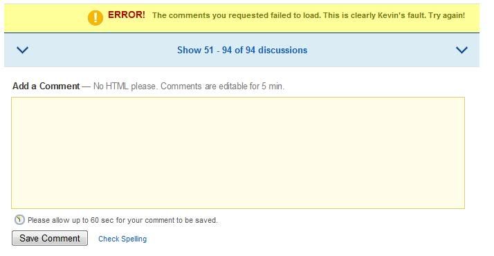
- The Digg 'Kevin`s fault' Message
- Nation Discount Broker's Duck Quack
- Twitter's Fail Whale
I think these examples embody what I'm looking for: novel ideas that helped cushion the disappointment of errors in an app, or things that just simply made an application more fun to use. Big or small, it doesn't matter.
What have you seen that amused you (in a good way) when using an app? Or what did you implement that users loved?
[Edit to add: If you, like Uri from comments, don't like REALLY novel stuff, what things that aren't in the "fun" category do you think are value-adds in this vein? I would argue, for example, that design decisions could enable users to more quickly and easily get to what they want from an app - what are examples of those sorts of things?]