views:

2446

answers:

2

I have three parameters x,y and t. But the problem is my file structure.

My files are named as:

e_x_y.txt
t_x_y.txt

where e_x_y.txt has the error for particular values of x and y and t_x_y.txt has corresponding time values.

I need to plot the values in e_x_y.txt on a x vs y vs t graph.

What is the best way to do that?

I know what x and y values are, so I don't have to deduct them from the file names.


To make things more clear,

suppose my files are:

e_4_5.txt
45
54
t_4_5.txt
2.0
6.0

e_7_8.txt
32
98
121
t_7_8.txt
2
9
1.0

I want to plot the following points:

(4,5,2.0) = 45
(4,5,6.0) = 54
(7,8,2.0) = 32 
(7,8,9.0) = 98
(7,8,1.0) = 121
+2  A: 

The type of plot you are trying to make may be difficult to visualize well. I can give you two suggestions: one is what you want, and one is what you should probably do instead...

Plotting 4-D data:

In order to do this, you will have to plot a series of x,y,t points and somehow represent the error value e at each point. You could do this by changing the color or size of the point. In this example, I'll plot a sphere at each point with a diameter that varies based on the error (a diameter of 1 equates to the maximum expected error). The color represents the time. I'll be using the sample data you added to the question (formatted as a 5-by-4 matrix with the columns containing the x, y, t, and e data):

data = [4 5 2 45; 4 5 6 54; 7 8 2 32; 7 8 9 98; 7 8 1 121];
[x,y,z] = sphere;  %# Coordinate data for sphere
MAX_ERROR = 121;   %# Maximum expected error
for i = 1:size(data,1)
  c = 0.5*data(i,4)/MAX_ERROR;  %# Scale factor for sphere
  X = x.*c+data(i,1);           %# New X coordinates for sphere
  Y = y.*c+data(i,2);           %# New Y coordinates for sphere
  Z = z.*c+data(i,3);           %# New Z coordinates for sphere
  surface(X,Y,Z,'EdgeColor','none');  %# Plot sphere
  hold on
end
grid on
axis equal
view(-27,16);
xlabel('x');
ylabel('y');
zlabel('t');

And here's what it would look like:

alt text

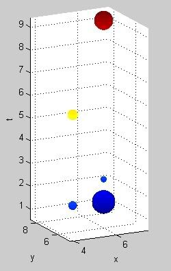
The problem: Although the plot looks kind of interesting, it's not very intuitive. Also, plotting lots of points in this way will get cluttered and it will be hard to see them all well.

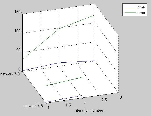
More intuitive 3-D plot:

It may be better to instead make a 3-D plot of the data, since it may be easier to interpret. Here, the x-axis represents the iteration number and the y-axis represents each individual network:

plot3(1:2,[1 1],[2 45; 6 54]);           %# Plot data for network 4-5
hold on
plot3(1:3,[2 2 2],[2 32; 9 98; 1 121]);  %# Plot data for network 7-8
xlabel('iteration number');
set(gca,'YTick',[1 2],'YTickLabel',{'network 4-5','network 7-8'})
grid on
legend('time','error')
view(-18,30)

This produces a much clearer plot:

alt text

gnovice
what is `peaks`?
Lazer
`peaks` is a built-in MATLAB function that is often used as a sample function of 2 variables in MATLAB demos.
gnovice
so, as I have different values of `x` and `y`, how should I define the `X`,`Y` and `Z` arrays?
Lazer
I mean how do I format `X`, `Y` and `Z` from my data?
Lazer
I think I'll need to know a little more about what your data specifically is and how it's generated to answer that.
gnovice
@gnovice I have added the details in the question. Please have a look.
Lazer
+2  A: 

Even though I am not convinced this the best way to visualize the data, here's a simple way to do it as you asked. You can plot the 3D points in a simple scatter plot, and map the size OR the color to the values of the fourth dimension error. Something like:

x = randi(20, [10 1]);
y = randi(20, [10 1]);
t = randi(10, [10 1]);
e = randi(200, [10 1]);

% map `e` to color
figure(1)
scatter3(x, y, t, 200, e, 'filled')
xlabel('x'), ylabel('y'), zlabel('t')
colormap(hot), colorbar

% map `e` to size
figure(2)
scatter3(x, y, t, e, 'filled')
xlabel('x'), ylabel('y'), zlabel('t')

color size

Amro
@Amro I have added an example to the question. Please have a look.I am not sure what you mean by: `you have two values across a time axis`
Lazer
It seems I misunderstood how the data looks like!
Amro
@Amro: You and me both! ;)
gnovice
sorry all for posting an unclear statement at first. my bad.
Lazer
how do I plot these points in 3D?
Lazer
From your comments above, `e` and `t` are values measured for each network configuration `(x,y)`, ie: `e = f(x,y)` and `t = g(x,y)`. Therefore it makes no sense to plot t against (x,y) and e. Rather IMO you should have two plots for each function
Amro
@Amro, `e` and `t` are the values of `error` and `time` for different iterations on the SAME network. Therefore it does make sense to plot them that way. In the above example, first couple of files, for `network 4-5`, first iteration took `2 seconds` and the error was `45` while the second iteration on the SAME network took `6 seconds` and the error was `54`.
Lazer
What I meant is that it make no sense to plot `error` as if it were a function of three variables `(x,y,time)` because it doesn't depend on `time` only `(x,y)`. `time` is simply another function of the same input `(x,y)`
Amro
yeah, actually. But, how do I plot it if I need to?
Lazer

related questions